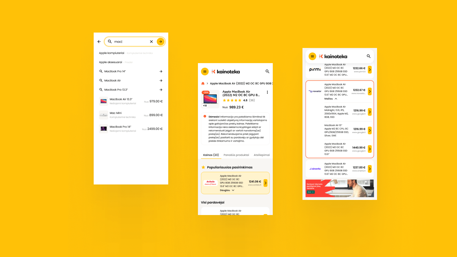
Kainoteka is a price comparison platform where decisions are born from data and value from clarity. Together with the client, we created a website that stands out in its category: bold, visual, and with a distinctive brand character that turns price searching into a pleasant experience.

Price comparison websites often look the same: tables, logos, numbers – and no uniqueness. Kainoteka wanted to go the opposite way. Our task was to create a platform concept where prices are not only found, but also understood instantly: visually, clearly, with consistent logic and a strong brand voice.
We started the project with the question: what does price comparison look like when it has an identity? The answer turned into a bold design foundation – colorful, clean and easily recognizable. Instead of the usual sterility, we chose a visual direction that allows prices to breathe: more rhythm, more contrast, more of the vivid character of Kainoteka.
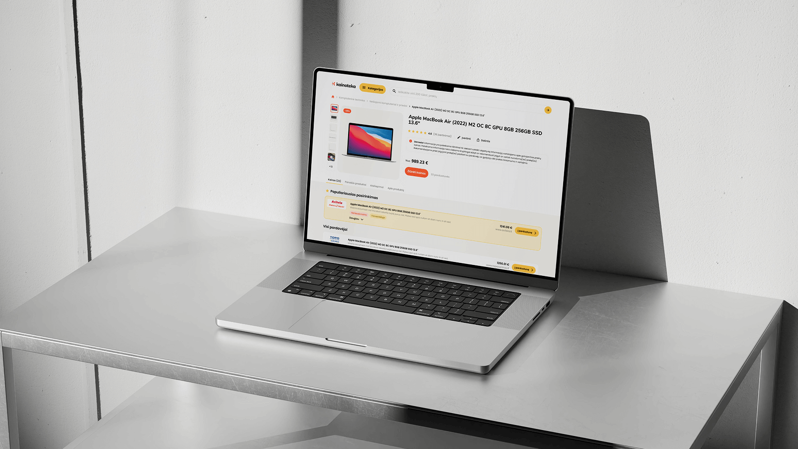
We designed the website experience to make every step feel confident, from finding a price to making a decision. The result is a unique website in its category that stands out not for its noise, but for its style.