Ratepunk is a travel tech product that helps users spot the most valuable flight offers faster and more easily access exclusive ticket deals without constant manual searching.
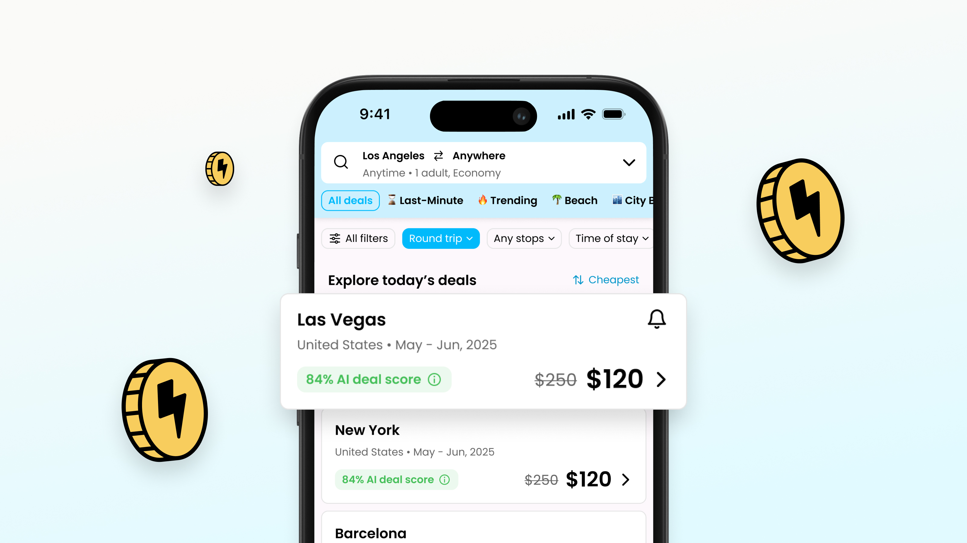

Ratepunk grew as an ambitious travel app, but as functionality grew, so did the unevenness of the experience – from lackluster flows to solutions that weakened the overall sense of product value. What was needed was not cosmetic fixes, but a consistent approach to how the user discovers offers, understands value, and moves through the entire travel planning process.
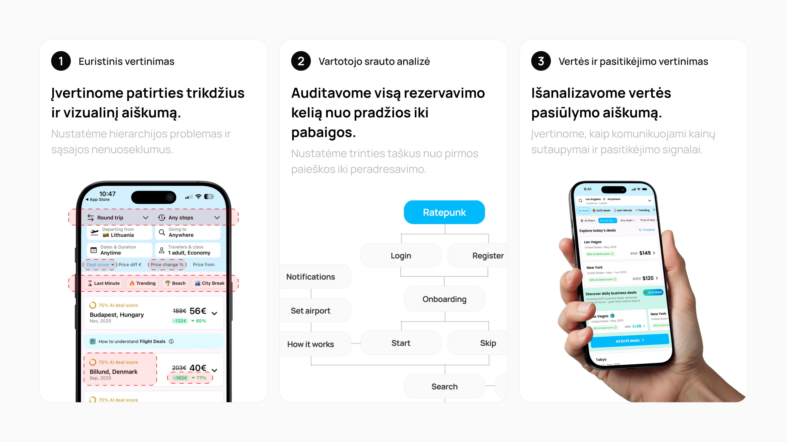
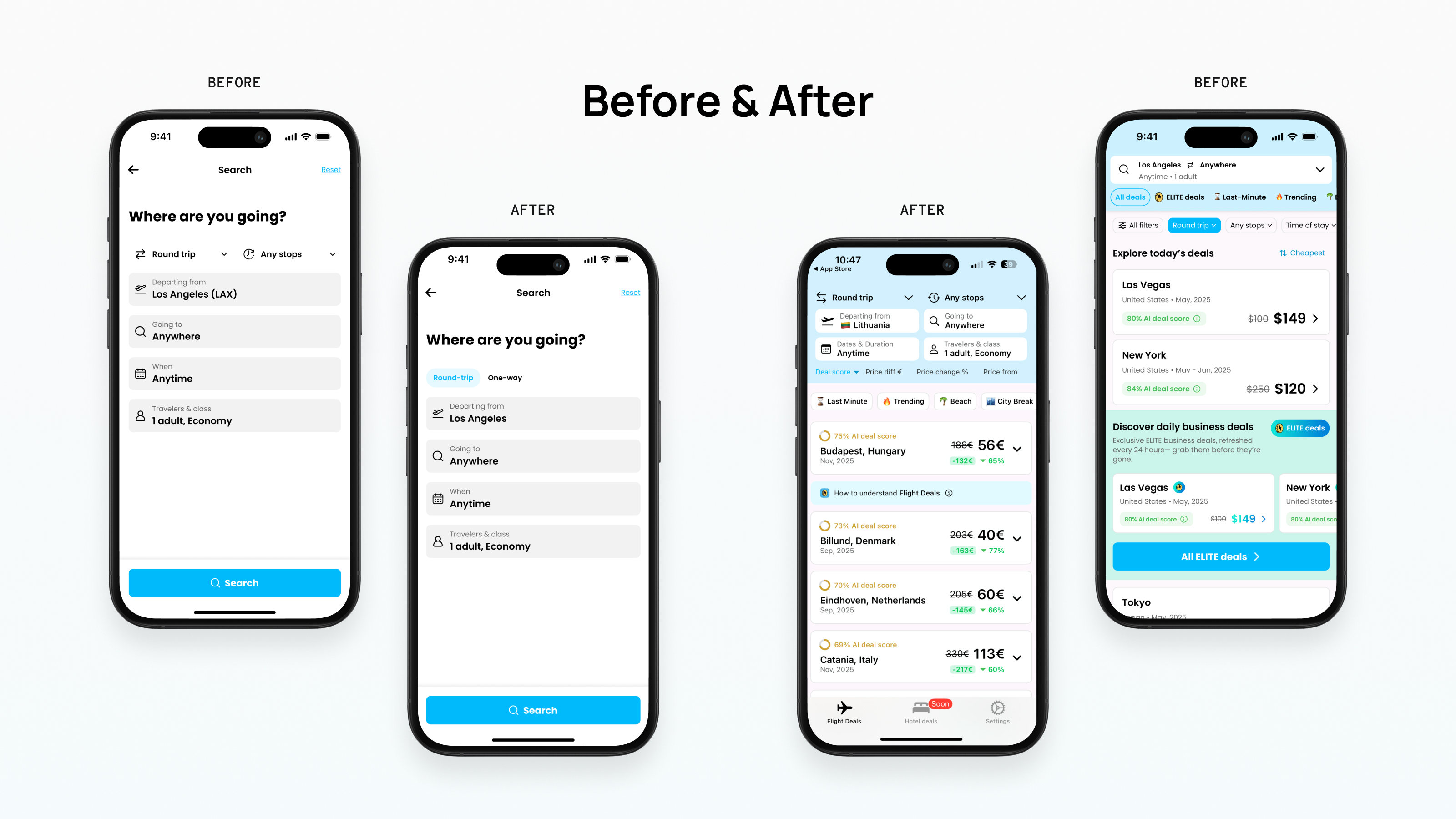
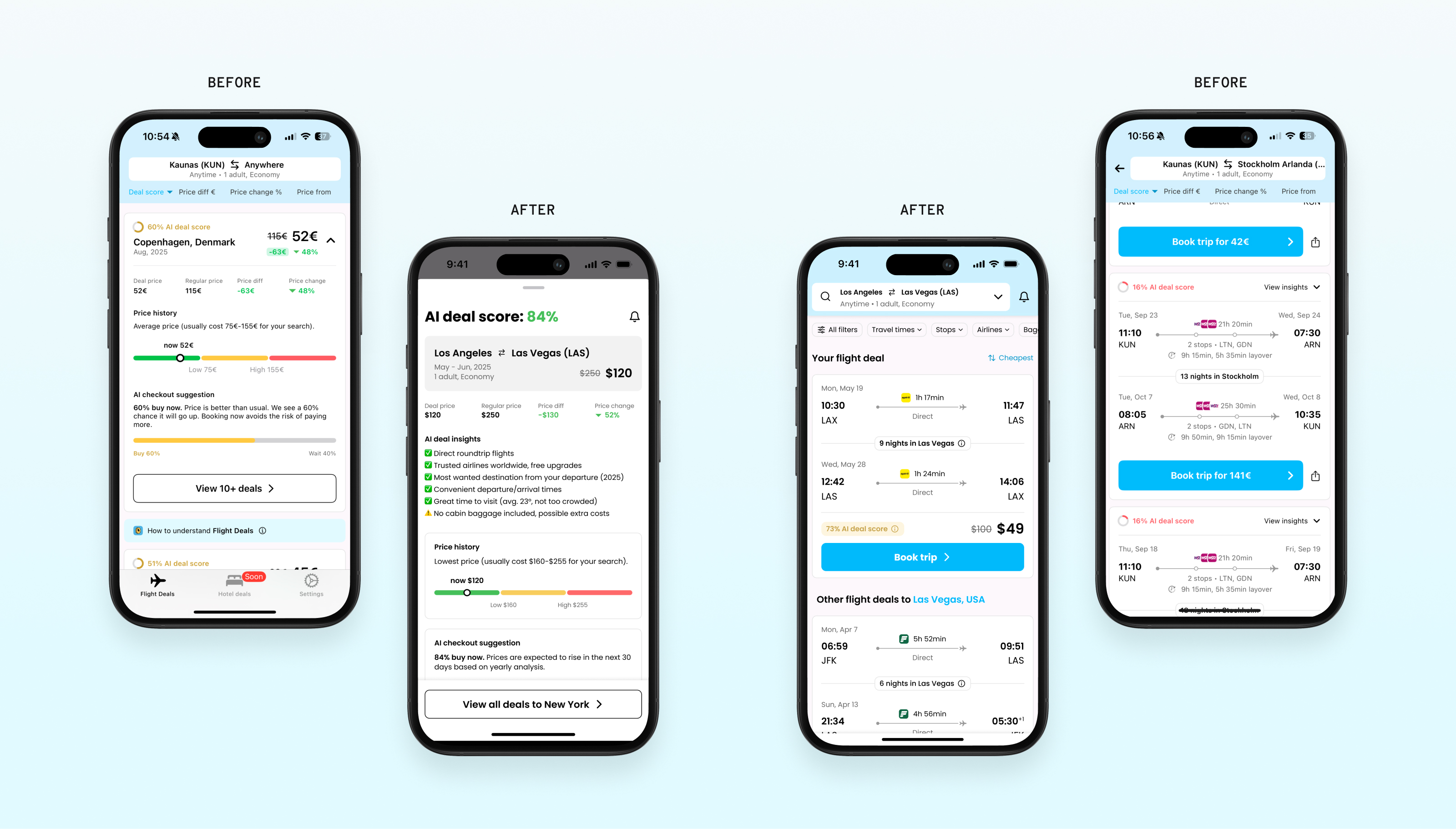
We started with an audit of the existing product, identifying problem areas, UX risks and design gaps. This was followed by consultations, research and benchmark analysis, which allowed us to base further decisions not on intuition, but on a clear direction. We developed this audit phase into UX wireframes, UI prototypes and a design system of key elements, which gave the product more consistency and flexibility for further development.
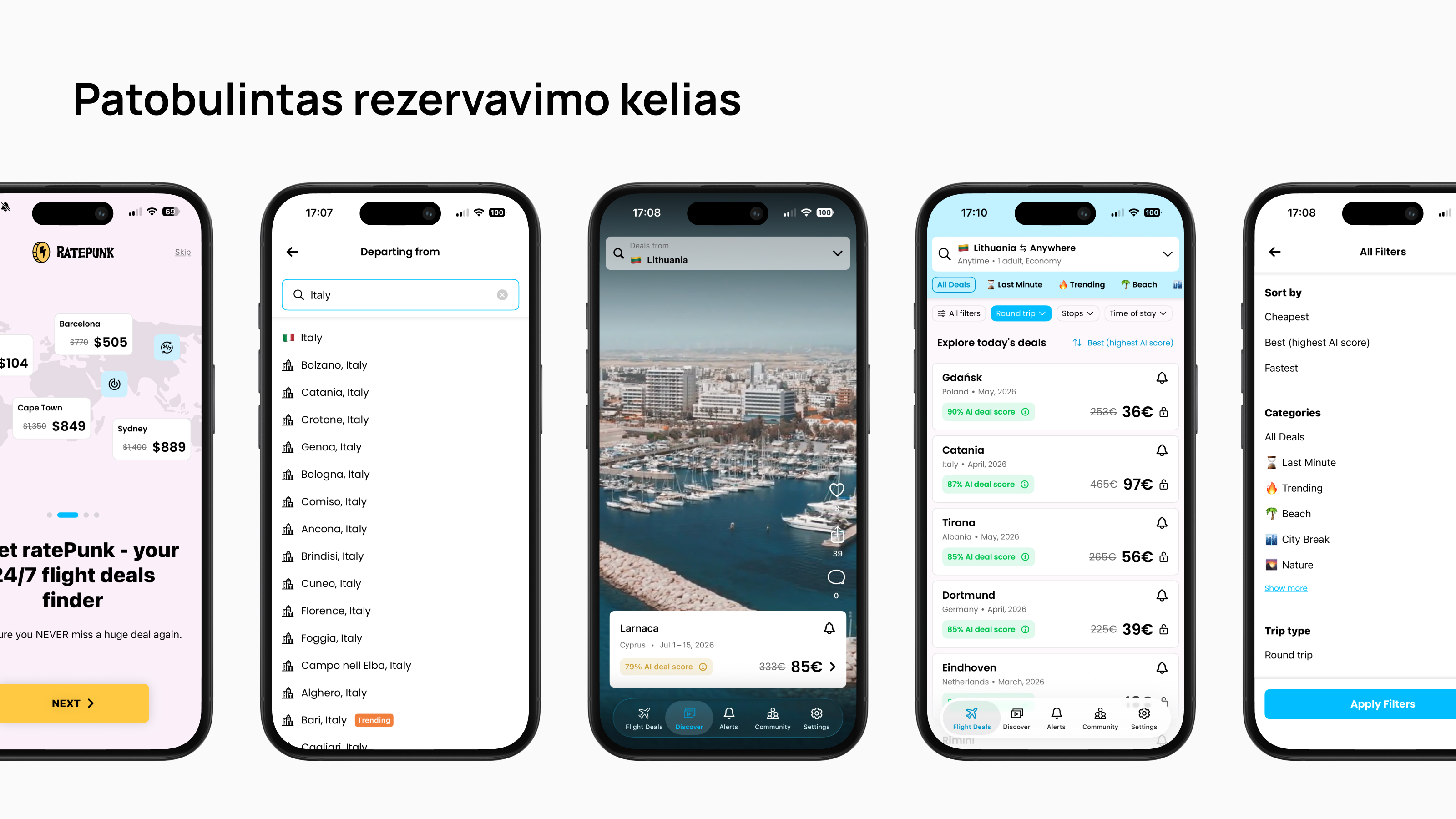
The result is not only smoother user flows, but also a more refined, mature user journey across the product. The updated experience helped to more clearly communicate the product’s value, reduced friction at key points, and strengthened the overall impression of Ratepunk as a modern and reliable travel tool.